Hydra Contracting
Branding, Print, Web DesignHydra Contracting
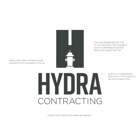
There are a limited number of people with the knowledge and experience required to repair and maintain fire hydrants, and even fewer companies who exclusively work on fire hydrants and waterline systems. Hydra’s logo needed to clearly and immediately communicate the company’s focus. A representation of a fire hydrant became a key component for their logo.
The negative space maintains the shape of the “H” And adds another layer of meaning.

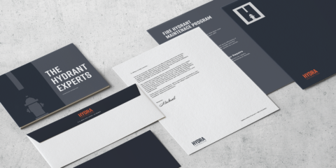
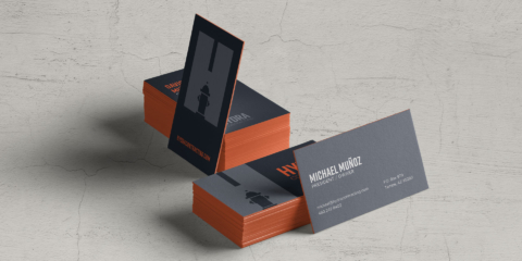
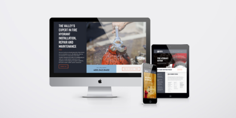
Fire Hydrants are are typically built from iron and steel. This fact, along with the industrial nature of the industry, inspired a modern and forceful color palette. The selection needed to be lively without being audacious. Hydra needed a professional brand identity that also helps them stand out in a crowd. In designs, the primary colors are greys which add a level of sophistication to the bright orange and blue.
