JFH Contracting
BrandingJFH Contracting

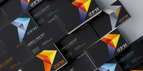
As a contracting company, JFH works in multiple corporate spaces including remodeling, cold storage, and commercial finishing. As part of a team, I helped created a brand system that would support the growth of each area of focus. The system allows each piece of the company to have an identifiable, differentiated look while keeping the visual cohesion of the entire brand.
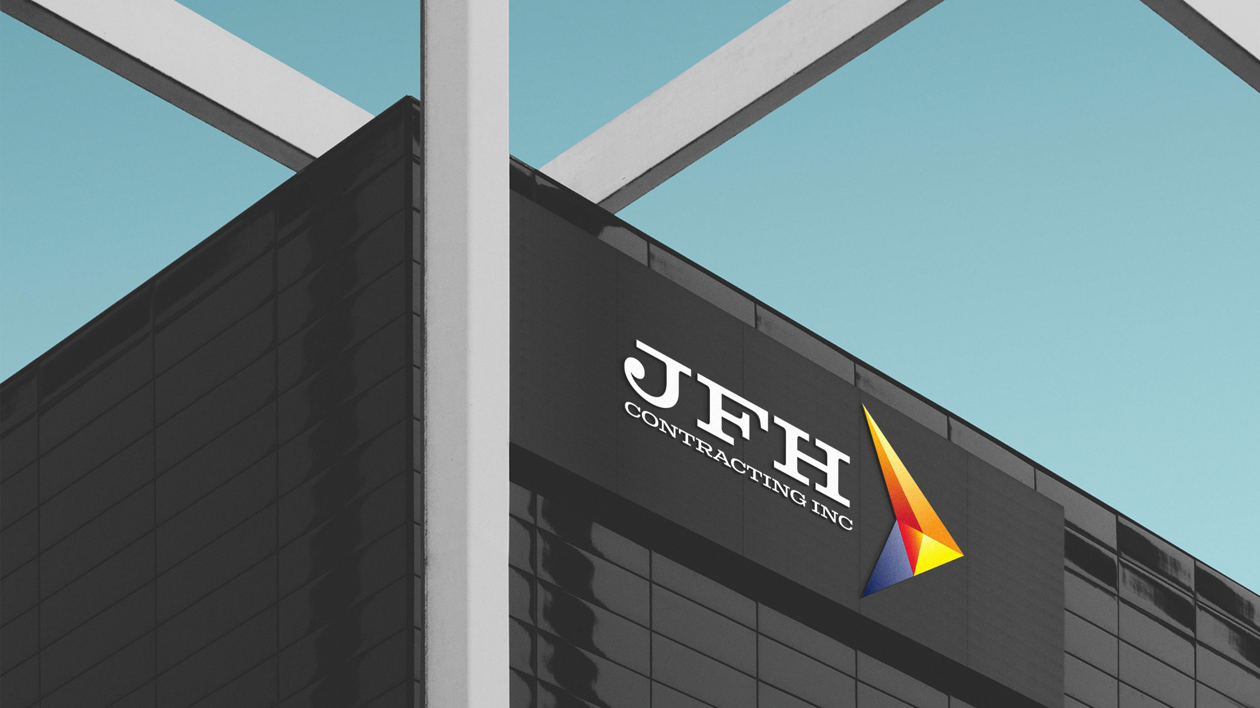
A prism style arrow points ahead representing both the physical structures of the contract industry, and the forward momentum of the company.


The history of JFH as a local Arizona business is an important part of the company’s story. The color palette is inspired by the desert and Phoenix sunsets. Color pairings are used to differentiate the company’s three areas of focus. On their own these colors don’t seem to be directly connected to Arizona, but once they are joined together as part of the master logo we see the desert influence come together.


