Underbelly
Branding, Print, Web DesignUnderbelly
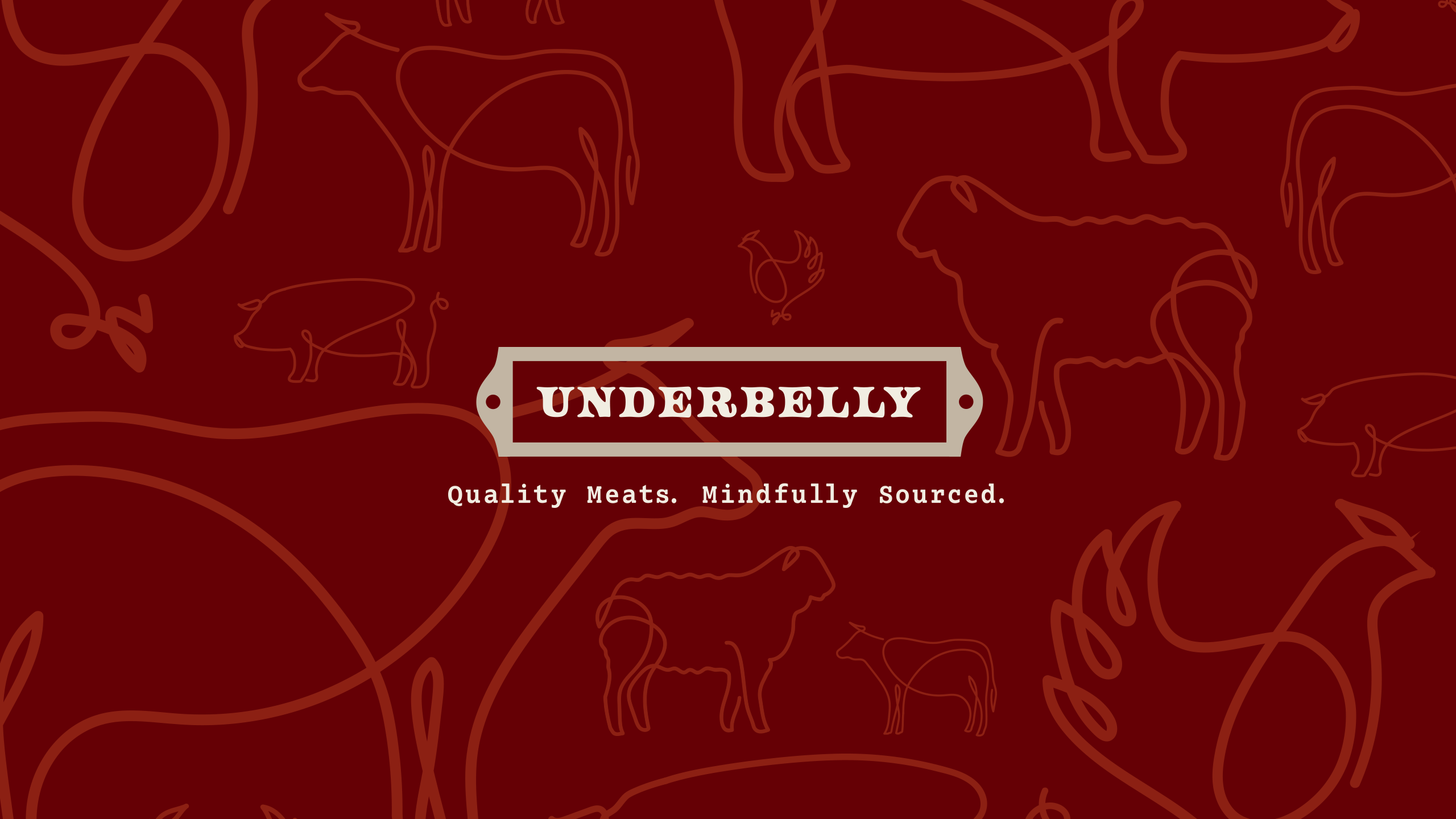
As a new small butchery in a large city Underbelly wanted to open its doors to a sense of community. Transparency, education, and sustainability are the pillars of the Underbelly brand. These values were the guide to developing a well-rounded suite of brand elements for the new butcher shop. The finished brand captures these values and maintains an air of approachability.
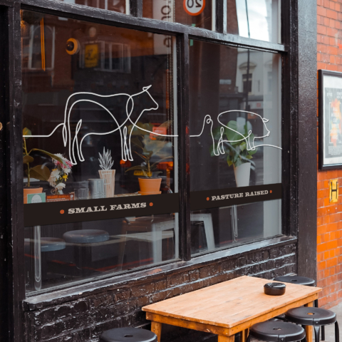
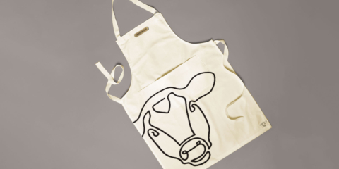
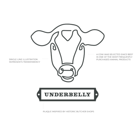
The logo was illustrated as a contour-line drawing; the single line represents the farm-to-table transparency that underbelly champions. Butchery is an old craft that takes years of dedication and skill to master. The badge design for the word Underbelly is an acknowledgement of this skill. The badge shape is based on old iron plaques that can be seen outside historic buildings.
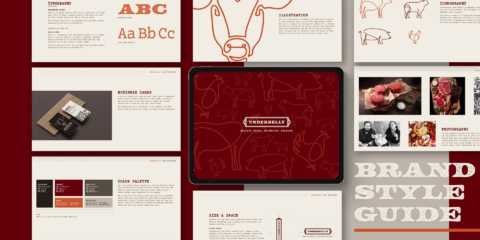
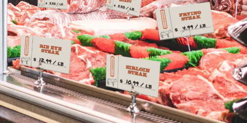
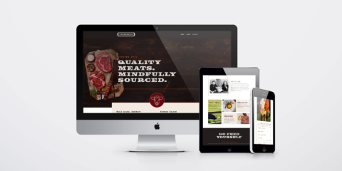
The Underbelly brand hinges on bold visual elements and thoughtful execution. Typewriter style typography and textured headlines are balanced with large swatches of color and grid-based layouts. This brand is implemented in a variety of different formats. The logo can be seen on the website, in print, as a stamp and as a food stencil, so the design needed to be flexible and allow for growth.
